Bottle and add design for Helga’s algae drink
Re-design of Helga’s algae drink bottle and image.
In today’s competitive beverage market, staying relevant and appealing to consumers is essential. One of the most effective ways to achieve this is through a comprehensive design of the product itself.
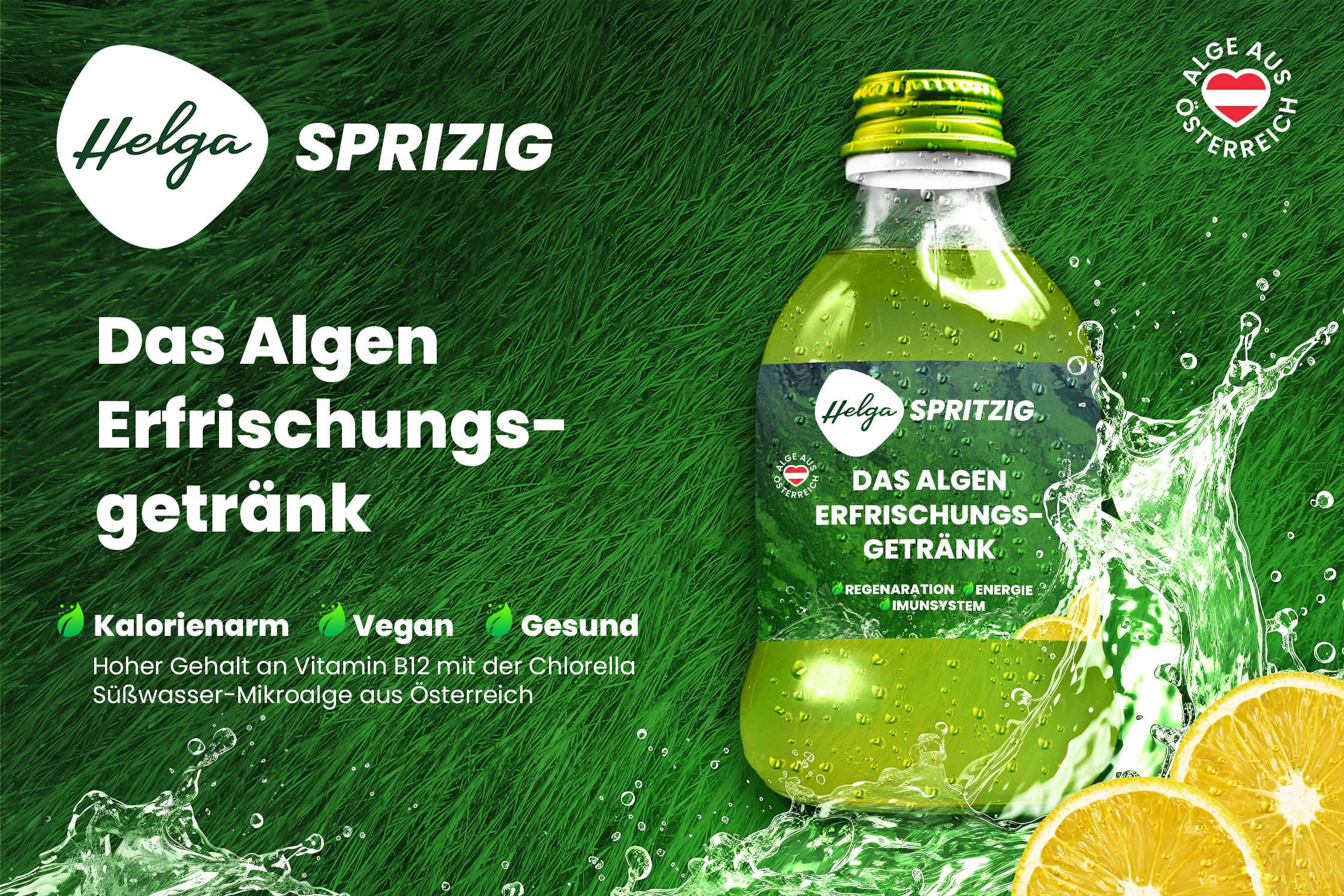
My aim was to create a new bottle shape that is more interesting and less traditional, accompanied by a fresh and invigorating label that emphasizes the refreshing aspect of the beverage, making it stand out as a delightful alternative to ordinary health drinks.
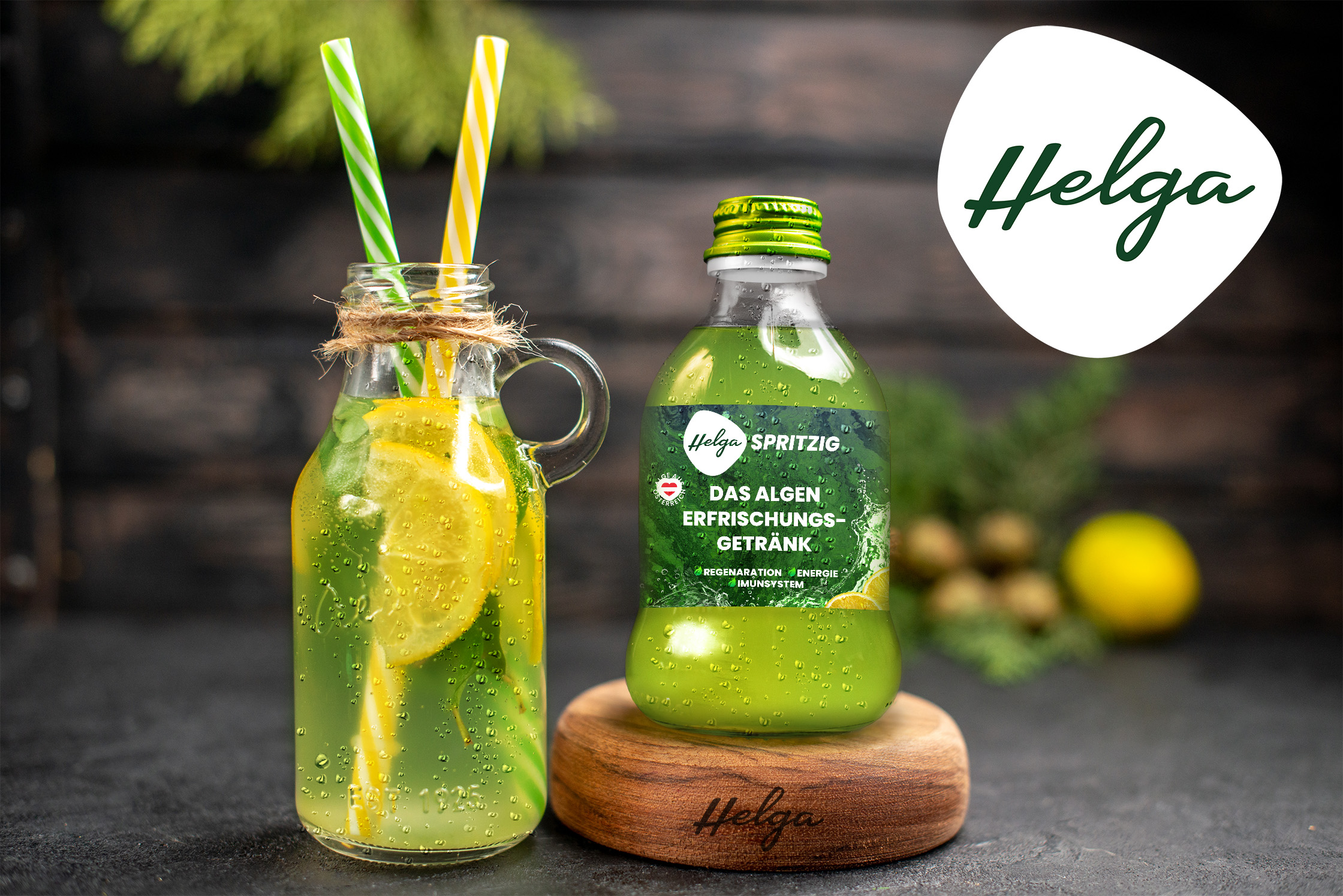
- The New Bottle Shape: One of the key aspects of the bottle redesign is to depart from the traditional wine bottle shape. To create a more intriguing look, I propose a round and soft bottle that catches the eye and is easily stored in a backpack. This shape not only sets your beverage apart from the competition but also gives customers the impression that the bottle is bigger than just 250ml.
- Emphasizing the Refreshing Aspect: The heart of this redesign project is to highlight the refreshing nature of your beverage. The choice of materials and colors will reflect the healthiness and refreshing quality of the drink. To achieve this, the label was designed in a more modern way with elements like water splashes and lemons to emphasize the refreshing and hydrating part of the drink. The Bottle will be made of glass and the label will be made out of UV-coated paper so that the whole drink feels more premium and also is made of 100% recyclable materials.
- The Fresh and Vibrant Label: To further emphasize the transformation from a bitter fruit juice to a refreshing lemonade, the label design is crucial. I propose a new label that incorporates vibrant shades of green and yellow, reminiscent of fresh citrus fruits combined with algae. A dynamic, modern font will be used for the product description, reflecting the drink’s contemporary appeal.
An algae background pattern that reflects the real Algae used for the drink was used as background texture for the label to further emphasize the core value of the drink’s healthy algae. - Clear Messaging: In addition to the visual changes, it’s essential to revamp the product description to resonate with consumers seeking a revitalizing beverage experience. That’s why for example the original “Prikelnd” was changed to “Sprizig” to boost the refreshing essence of the beverage.
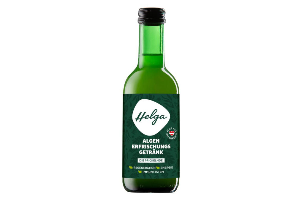
The first image is the new design presented as a mock-up that can also later be used as marketing material. The second image is the original design of the bottle.
Some possible add design for either a social media post or as a flyer to give out in local supermarkets.