Logo & marketing material for Tee Stricker
I decided to create a new logo and some new marketing materials for Tee Stricker a tea vendor in Saarbrücken I visit regularly. Tee Stricker’s logo and general design representation are quite outdated and where in urgent need of a remake.
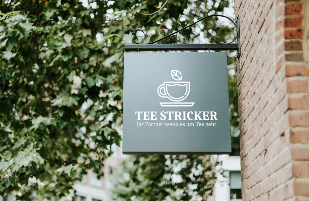
At first, I started with the redesign of Tee Stricker’s logo. I used this chance to get a feeling of what could work for the client and how I could later approach the other designs that I was going to create. Because the client didn’t have a clear image of what the new logo could look like, I made some prototype ideas as a base for explaining and demonstrating certain possibilities and their advantages.
After that, I refined the best rough idea and incorporated some other impulses I got, and then made the final logo design.
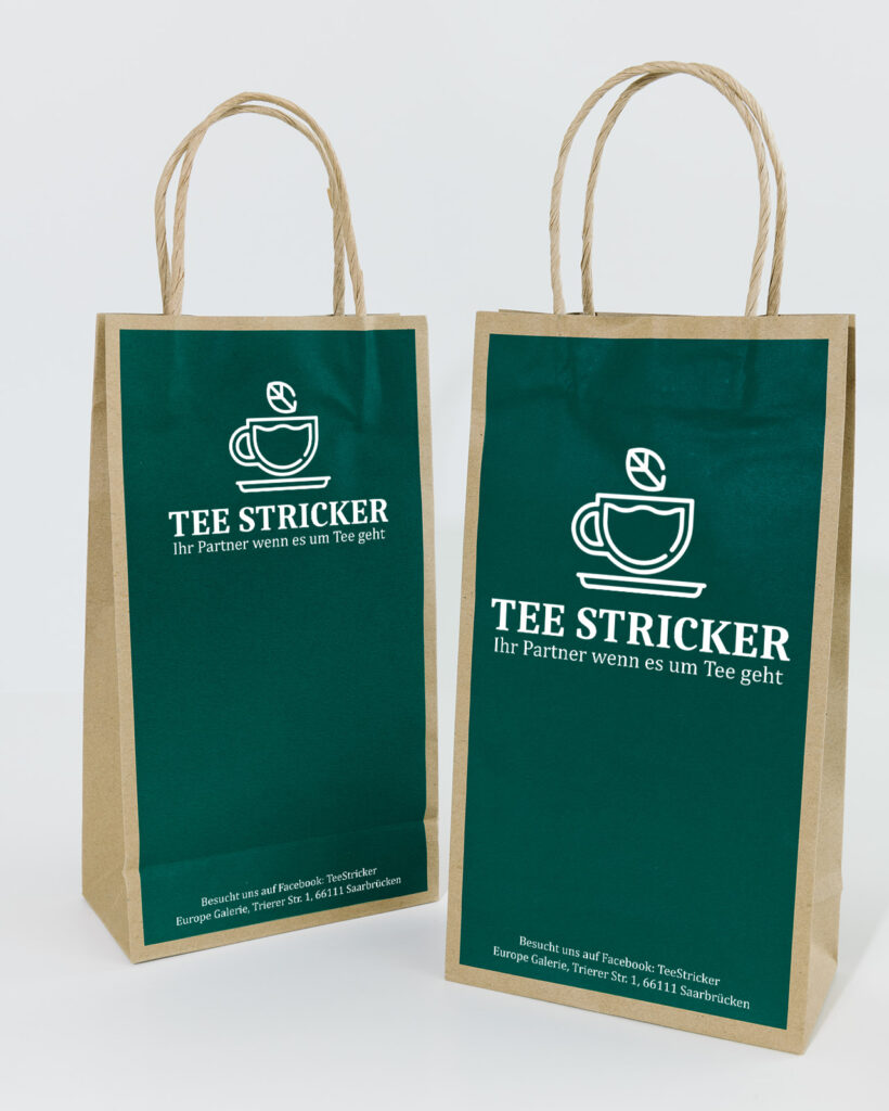
The final logo is a lot more cleaner and modern than the old one but it still keeps a bit of its classiness through the typography that I choose, which was one of the key factors. The icon is easy to look at but complex enough that it creates visual interest. The icon also immediately emphasizes the tea aspect and tell the viewer what it is about.
To showcase the final logo in actual use I created some mock-ups of it and also made a first advertisement design with it.
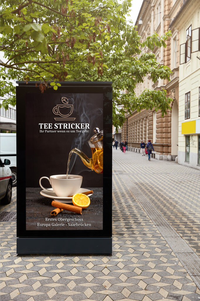
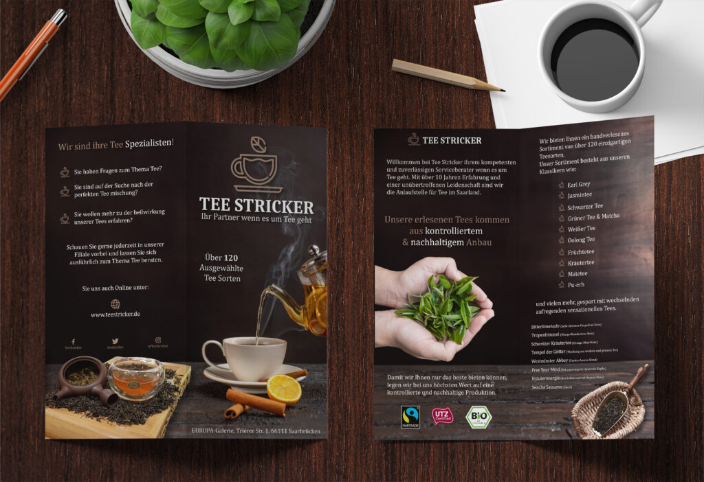
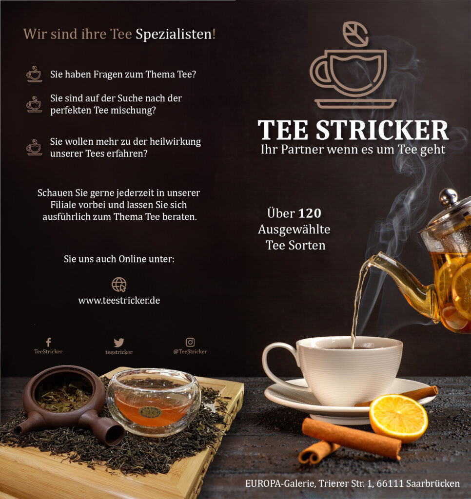
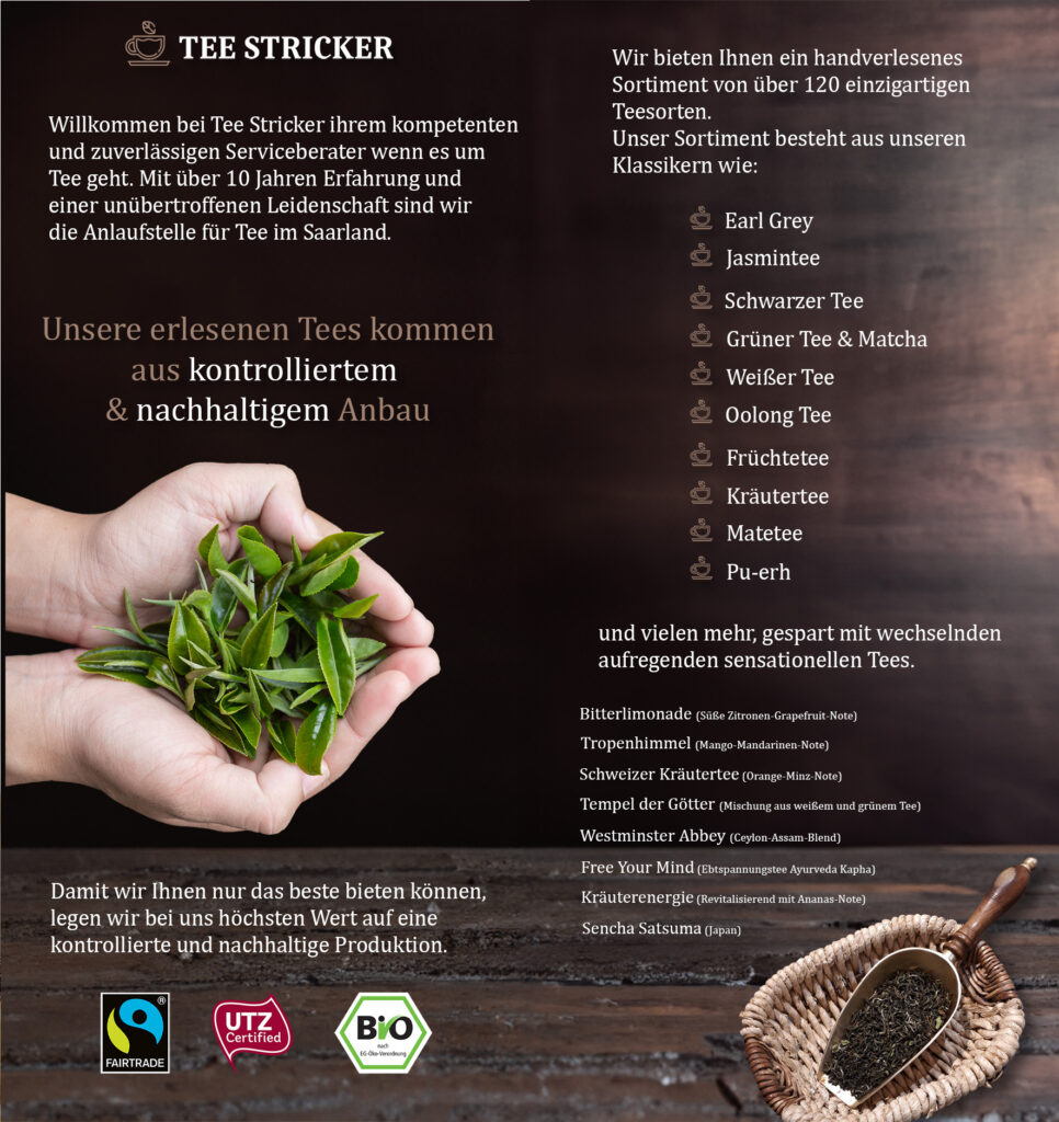
Based on the new logo and the information I gathered so far as well as the response from the above advertisement, I started with the flyer design. First, I tried to come up with the best selling points of the business and how I could emphasize them as much as possible.
The key points were: the big selection of types of tea, the quality, and the sustainability of the tea, the broad knowledge and the service the business could provide, the health benefits of the teas, as well as the interesting and a bit unusual tea combinations of the shop.
With these things settled and the general design language already defined I worked on incorporating all these things into one compact flyer. The design, it’s a mixed of modernity with class and elegance, that’s why I used a dark and timeless background and emphasized the already established brownish color theme with slight accents of brighter color to thrive engagement. If you look at the flyer you should feel like you are in a warm and comfortable relaxing shop, with the smell of fresh tea leaves in the air, while listening to classical music. This feeling should motivate you to visit the shop and maybe buy some relaxing high-quality tea.